17 Jan 2025
foodpanda
Navigation Experience
Navigation Experience
Navigation Experience
Problem statement
Problem statement
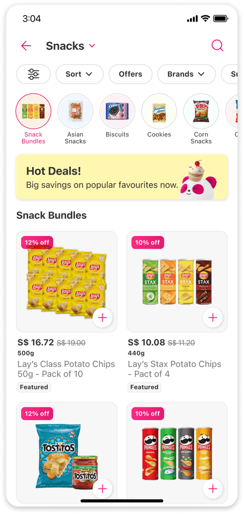
The current horizontal scrolling navigation on foodpanda's shopping page limits visibility to just 3 to 4 out of 40 categories at a time.
This limitation resulted in hidden categories receiving much less user engagement and interaction.
Accessibility challenges, hindering a seamless browsing experience.

"Yes, I am not very efficient for exploration 😢"
— horizontal scrolling
Data
Data
Our data indicates this design shortcoming, emphasising the critical need for a navigation overhaul to facilitate more comprehensive browsing and improve overall user experience.
Our data indicates this design shortcoming, emphasising the critical need for a navigation overhaul to facilitate more comprehensive browsing and improve overall user experience.

Hypothesis
Hypothesis
We believe that enhancing the navigation experience and increasing the visibility of categories will encourage users to explore our product range more thoroughly, helping them discover items that meet their needs and interests.
We believe that enhancing the navigation experience and increasing the visibility of categories will encourage users to explore our product range more thoroughly, helping them discover items that meet their needs and interests.
Success Metrics
Success Metrics
Increase the no. of distinct categories user visits per session
Sessions that made a transaction after visiting the category page
Increase average amount spent by users (ABV)
Increase the no. of distinct categories user visits per session
Sessions that made a transaction after visiting the category page
Increase average amount spent by users (ABV)
What did the users said about the existing design?
What did the users said about the existing design?
During an unmoderated usability testing session, I gathered some valuable feedback
During an unmoderated usability testing session, I gathered some valuable feedback

Building on this context, let me take you through the new design, showcasing its enhancements and the range of ideas explored to achieve it.
Building on this context, let me take you through the new design, showcasing its enhancements and the range of ideas explored to achieve it.
Explorations
Explorations
Exploration 1 - Dropdown
Exploration 1 - Dropdown
✅ Pros
✅ Pros
Neater and cleaner look, reduces cognitive load
Easier navigation & quick overview, a dropdown menu allow users to see all available options at once and easily select the one they need
Reduce vertical screen space usage by 44px
Better accessibility
Neater and cleaner look, reduces cognitive load
Easier navigation & quick overview, a dropdown menu allow users to see all available options at once and easily select the one they need
Reduce vertical screen space usage by 44px
Better accessibility
⚠️ Cons
⚠️ Cons
A dropdown menu can give the impression that users need to commit to a decision, as they must select an option from the list
Users will have difficulty identifying the next category they will swipe to.
Users may confuse the "swiping" gesture for switching between subcategories rather than categories, leading to confusion during navigation.
Exploration 2 - Floating Pagination
Exploration 2 - Floating Pagination
✅ Pros
✅ Pros
A text pagination component is introduced at the bottom of the page to give users the affordance that the page can be swiped.
User is able to identify the next or previous category they will swipe to
A text pagination component is introduced at the bottom of the page to give users the affordance that the page can be swiped.
User is able to identify the next or previous category they will swipe to
⚠️ Cons
⚠️ Cons
New component, requires more development effort
When a new component with a different behaviour is introduced, users may need to spend time learning how to use it in order to navigate the interface effectively
May not know that it can be interact to open a bottom sheet
New component, requires more development effort
When a new component with a different behaviour is introduced, users may need to spend time learning how to use it in order to navigate the interface effectively
May not know that it can be interact to open a bottom sheet
Exploration 3 - Floating Button
Exploration 3 - Floating Button

✅ Pros
✅ Pros
This is an existing component, and it currently being used in yemeksepti, which will be easy to implement
This is an existing component, and it currently being used in yemeksepti, which will be easy to implement
⚠️ Cons
⚠️ Cons
When components are moved to a new position within an interface, it can create a learning curve for users who are not aware of the change. This is particularly true for components that users frequently interact with or rely on to complete tasks.
Users may need to re-learn where to find the component and adjust their eye movements accordingly, which can take time and effort
Does not provide users with the affordance that the page can be swiped
Users will have difficulty identifying the next category they will swipe to
These concepts were presented to management and stakeholders, leading to a second round of usability testing for further validation.
These concepts were presented to management and stakeholders, leading to a second round of usability testing for further validation.
The navigation that delivered results
The navigation that delivered results
The design that outperformed the existing one is the dropdown navigation . Here's a look at the results.
The design that outperformed the existing one is the dropdown navigation . Here's a look at the results.
Quantitative data
Quantitative data
All participants were given a task to find the ‘Beverage’ category for both Control & Variant
All participants were given a task to find the ‘Beverage’ category for both Control & Variant

*Control here refers to the existing design, the horizontal scrolling pill buttons. Variant refers to the dropdown navigation
Clearly, the variant design delivered better results in terms of the percentage of participants completing the task. More notably, the substantial decrease in the percentage of participant mis-clicks, and the average time taken to complete the task.
Let’s take a closer look at the new navigation.
Clearly, the variant design delivered better results in terms of the percentage of participants completing the task. More notably, the substantial decrease in the percentage of participant mis-clicks, and the average time taken to complete the task.
Let’s take a closer look at the new navigation.
New navigation
New navigation
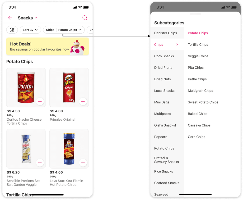
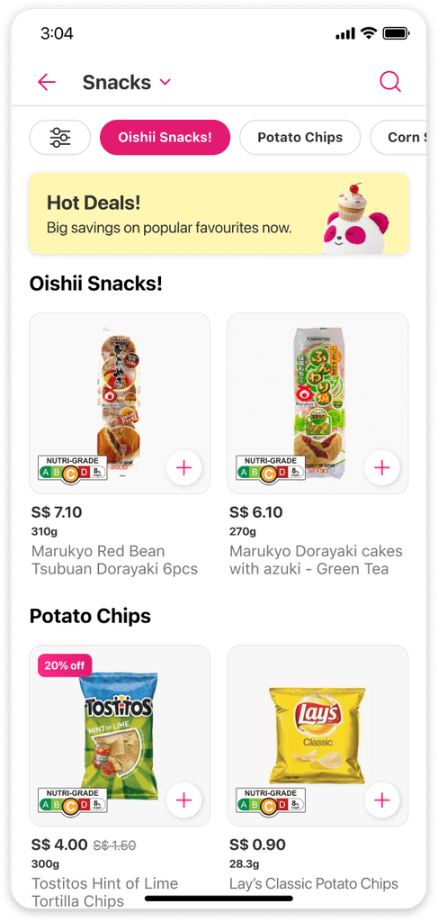
We've redesigned our category browsing interface, transitioning from the horizontal scrolling system to a dropdown menu that reveals a bottom sheet. This change allows users to view more categories at a glance and easily explore those that were previously hidden.
We've redesigned our category browsing interface, transitioning from the horizontal scrolling system to a dropdown menu that reveals a bottom sheet. This change allows users to view more categories at a glance and easily explore those that were previously hidden.

We also conducted a usability test on the bottom sheet, focusing on two distinct styles: a grid and a list view.
We also conducted a usability test on the bottom sheet, focusing on two distinct styles: a grid and a list view.

In our tests, a recurring suggestion was alphabetically arranging categories. We hesitated initially, mindful of potential mismatches with other pages and uncertain benefits. However, recognising its value in improving navigation for users seeking specific items, we're open to exploring this in future A/B testing, despite its rare use among competitors.
In our tests, a recurring suggestion was alphabetically arranging categories. We hesitated initially, mindful of potential mismatches with other pages and uncertain benefits. However, recognising its value in improving navigation for users seeking specific items, we're open to exploring this in future A/B testing, despite its rare use among competitors.
How does it work?
How does it work?
Upon clicking on the dropdown, users will be greeted by a bottom sheet that smoothly slides upward, revealing the list of categories. Each category text is paired with its respective image, delivering a visually-appealing and intuitive browsing experience.
Upon clicking on the dropdown, users will be greeted by a bottom sheet that smoothly slides upward, revealing the list of categories. Each category text is paired with its respective image, delivering a visually-appealing and intuitive browsing experience.
Here's what the users said about the new navigation
Here's what the users said about the new navigation

😍 Like
😍 Like
Less crowded interface
Easier navigation
Better Organisation
Less scrolling required
Less crowded interface
Easier navigation
Better Organisation
Less scrolling required
🤔 Concern
🤔 Concern
Additional Click
Additional Click
Motion design
Motion design
In this project, integrating motion design has been a key strategy for educating users about new features and the changes implemented on the page.
In this project, integrating motion design has been a key strategy for educating users about new features and the changes implemented on the page.
Overlay Tooltip
Overlay Tooltip
How might we ensure users notice and understand the new dropdown feature in the category navigation during their first visit?
How might we ensure users notice and understand the new dropdown feature in the category navigation during their first visit?

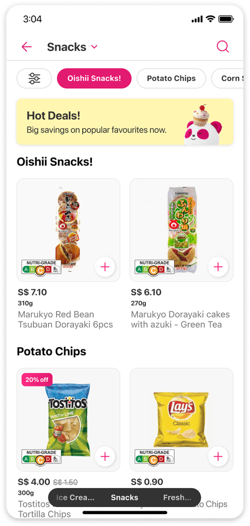
Category Transition
Category Transition
How might we use motion design to subtly indicate the presence of the swipe gesture without overwhelming users with extra components?
How might we use motion design to subtly indicate the presence of the swipe gesture without overwhelming users with extra components?

Swiping Gesture
Swiping Gesture
Here’s a GIF showcasing the swipe functionality on the category page
Here’s a GIF showcasing the swipe functionality on the category page

Future initiatives
Future initiatives
This project serves as a foundation for future initiatives and improvements.
This project serves as a foundation for future initiatives and improvements.
Project 1
Project 1
How might we redesign the Sort & Filter feature to enhance its visibility and boost its usage?
How might we redesign the Sort & Filter feature to enhance its visibility and boost its usage?

Project 2
Project 2
How might we innovate our app's subcategory navigation to efficiently manage the influx of new SKUs, improve the user experience and ensure smooth product discovery?
How might we innovate our app's subcategory navigation to efficiently manage the influx of new SKUs, improve the user experience and ensure smooth product discovery?